Aileen Allen, the DIY blogger behind At Home in Love, gives a boring bathroom a beautiful budget-friendly makeover.
A Boring Builder Bathroom Gets a Budget-Friendly Makeover
My husband and I enjoy working on house projects, but our skills are limited. So when we were house hunting last year, our goal was to find a cosmetic fixer. We wanted a house in a desirable neighborhood, with a good layout, up-to-date plumbing and electrical, and no structural issues–but with outdated looks so we could still add value. I love the charm and curb appeal of old houses, but we could not find one that fit that criteria within our price range (they all needed major work, plus they had choppy layouts that we didn’t love).
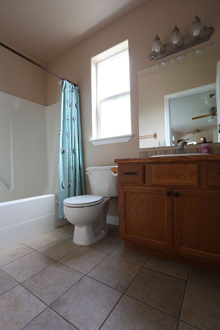
I eventually agreed to look at newer homes with my husband. The house we ended up buying is a builder basic 90s house–totally not what I originally envisioned! But it checked all our boxes: great neighborhood, an open layout that’s perfect for our family, no structural issues, and PLENTY of room for cosmetic improvement. This house had not been updated since it was built. Every room still had boring builder grade lights and beige paint, and the kitchen and bathrooms featured orangey oak cabinets and speckled laminate countertops. We started with the easy stuff–painting and switching out light fixtures–while we saved up for a bigger project. With the one year mark approaching, we finally felt ready to tackle our first remodel: the guest bathroom!
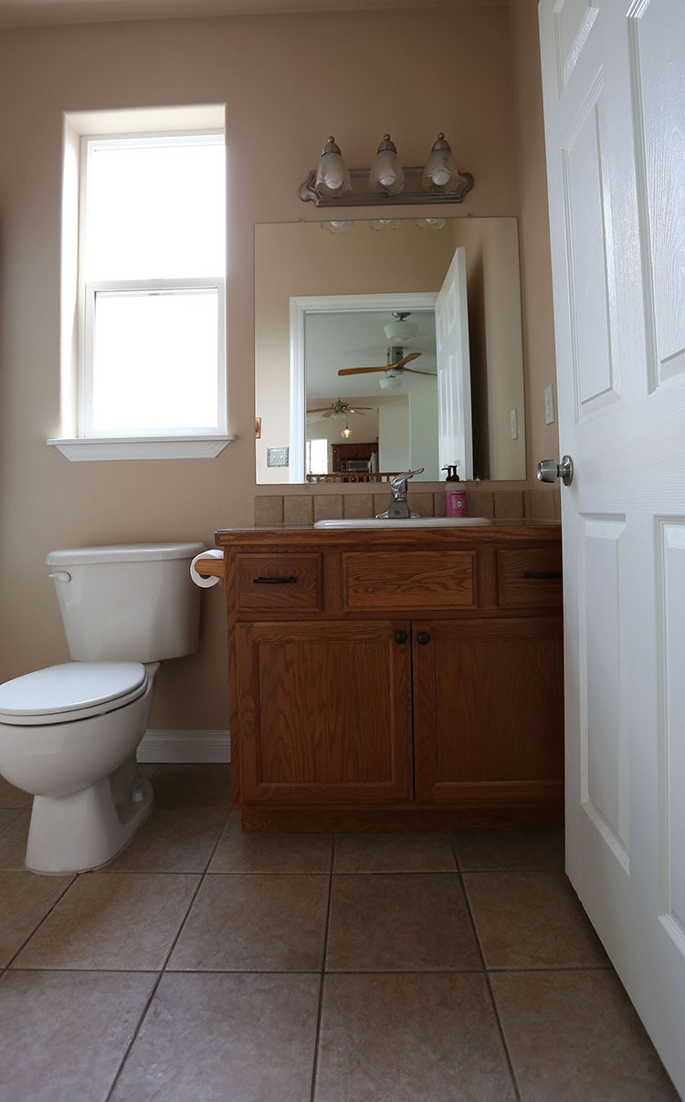
We were renters before we bought this house, so we don’t have a lot of remodeling experience. We purposely decided to start with a bathroom, so we could learn on a smaller space rather than jumping right into the kitchen. Plus, bathroom budgets are a little easier to swallow…it’s going to take us a bit longer to save up for the kitchen!
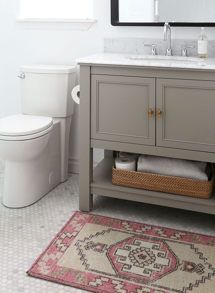
We had a total of $5,000 set aside for this bathroom. That’s well below the national average for bathroom remodels, but we love the challenge of finding budget-savvy ways to get what we want. One of the best ways to keep your bathroom budget in check is to keep the same general layout, since moving plumbing or electrical can quickly add up. Inexpensive versions of the high-end designer fixtures are available, which makes for great savings. And we did some of the work ourselves to save on labor costs.
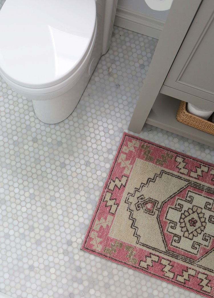
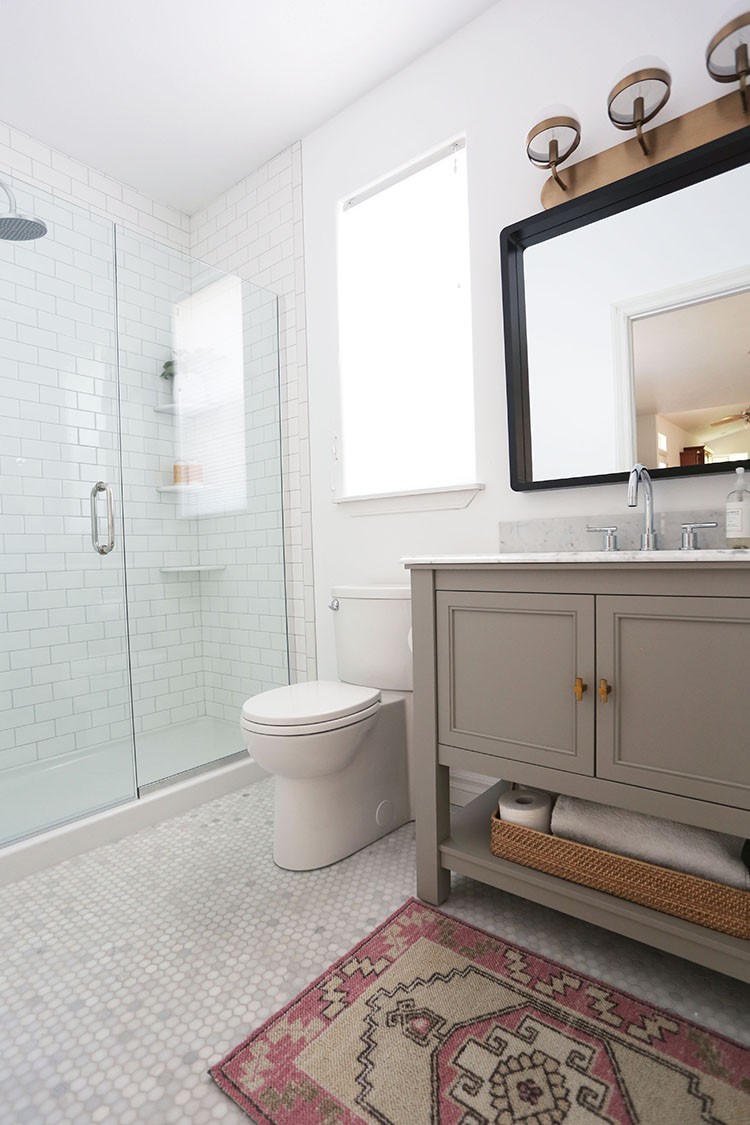
Since we don’t plan to live in this house forever, we also made decisions with future resale in mind. We went with classic, neutral, timeless choices in the permanent stuff like the tile and vanity. Then we added a little more personality with inexpensive accents that are easier to switch out, like the pink rug and the modern light fixture.
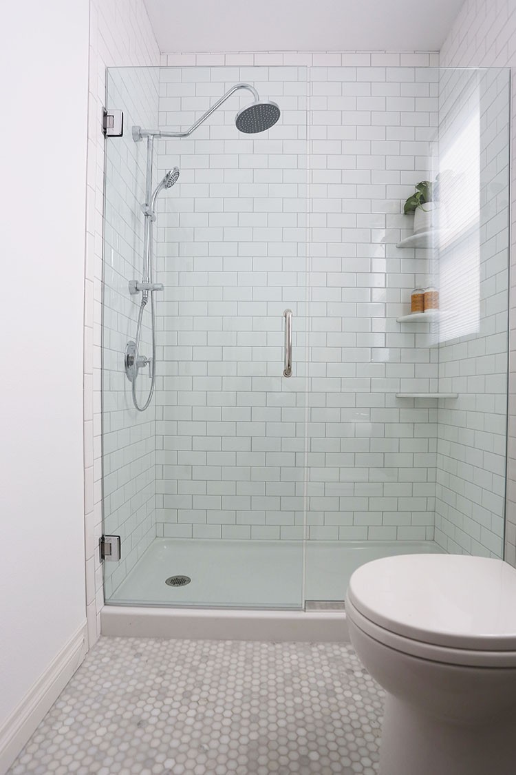
One controversial decision was whether to put in another tub-shower combo or a walk-in shower instead. We went back and forth on this sooo many times, but in the end we decided to go with the big, beautiful shower. There are two other tubs in our house, so the impact to resale is (hopefully) minimal, and we both take showers waaay more than baths. We have another full bathroom for bathing our kids, and we still have a tub in our master bathroom if we want a soak. Most guests, we figured, would be showering to get ready, so stepping over the tub would just be an annoyance 99% of the time.
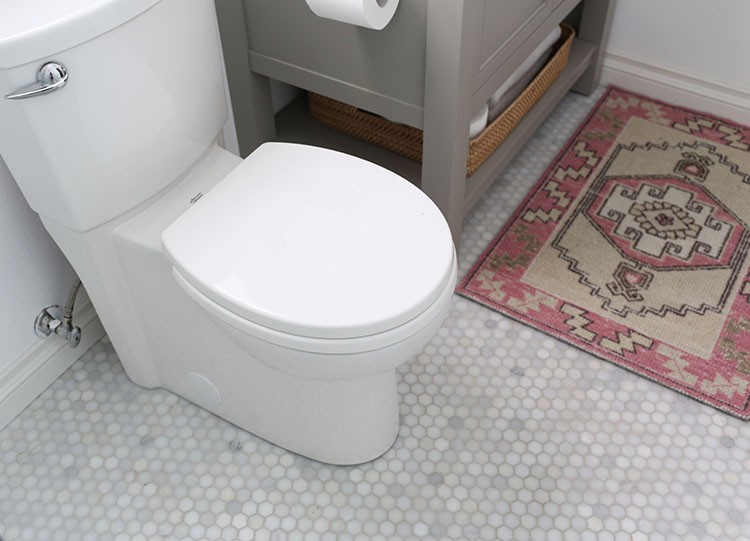
A few of my favorite features are the glass shower door, which lets in so much sunlight while you’re showering, and the streamlined toilet which doesn’t have all the curves on the side that are so gross to clean (I know, I’m getting excited about a toilet–what a weirdo!).

I also adore the marble topped vanity and the rounded corner mirror, which was significantly more budget-friendly than the trendy ones I was inspired by.
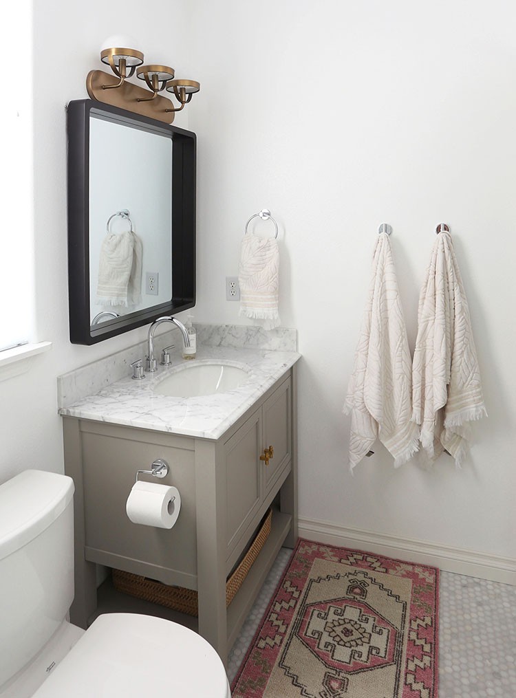
Speaking of trends, I decided to try mixing metals in this bathroom, and I’m so happy with the result. We chose chrome as our main metal, since almost everything is available in that finish. Then we installed a brass light fixture to add some warmth and variety.
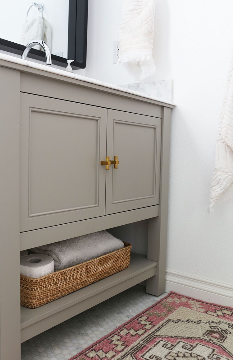
To make the brass feel more intentional, we repeated it with the knobs on our vanity (we switched out the chrome knobs that the vanity came with–an inexpensive way to make it feel more custom). The mirror‘s matte black frame brings in a third finish that goes with everything.

We absolutely LOVE how this bathroom turned out, and it honestly brings me joy every day, whether I’m showering in there or simply walking by. Even cleaning it is fun! There’s something extra satisfying about the fact that WE designed it and made it happen, versus buying a house with a bathroom that was already nice. The only bad thing? Now I’ve got the remodeling bug and I am dying to update our kitchen and master bath!
Before:
After:
Sources:
Floor tile / Wall tile / Grout / Glass door / Showerhead / Shower pan / Vanity / Vanity knobs / Toilet / Rug / Mirror / Light fixture / Faucet / Towel hooks / Towel ring / Toilet paper holder / Paint
Read up on more bathroom ideas on The Home Depot blog.
The post A Boring Builder Bathroom Gets a Budget-Friendly Makeover appeared first on The Home Depot Blog.


