
Stylish Kitchen Makeover with Help from a Kitchen Designer
After years in several rentals, we’ve seen our share of bad kitchens. When it came time for a kitchen makeover in our first home, we knew exactly what we wanted—and more importantly—what we didn’t want!
One of the things that we loved most about our house when we purchased it three years ago was how open the main living space was, with the exception of the kitchen. We knew that it had potential. With a new space plan, brighter finishes, and improved cabinets and appliances, our kitchen went from cramped and dysfunctional to a room that flows with the rest of our house.
It was so easy working with The Home Depot kitchen designer to bring our exact vision to life! Come on inside to see how it came together!
Before

First, here’s a before. The space was dark and cramped for one person (let alone multiple people). Narrow walkways, an awkward corner sink that was hard to reach, a tiny island, angled tile transition and cramped corner cabinets made the space feel claustrophobic.
After meeting with the kitchen designer at The Home Depot, we were able to go over the issues with our space and find solutions with Kraftmaid cabinets.
Custom Flooring
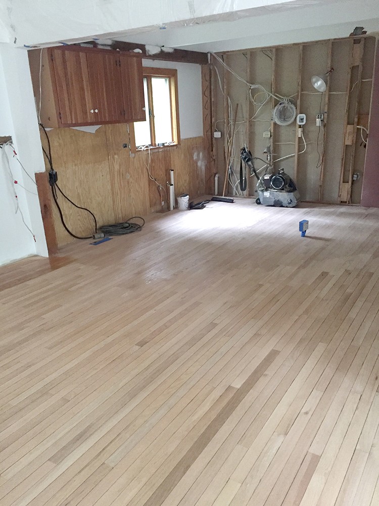
Since we had hardwood everywhere in the main living space except in the kitchen, we wanted to remove the tile and run the hardwood into the kitchen for continuity and flow. We installed unfinished hardwood in the kitchen and then the floors were sanded and refinished.
In-Progress Cabinets
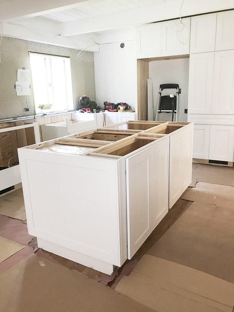
After planning and working through the plumbing, electrical and floors, WOW did it come together in just a few days after the cabinets were installed!
Kitchen Makeover Final Reveal
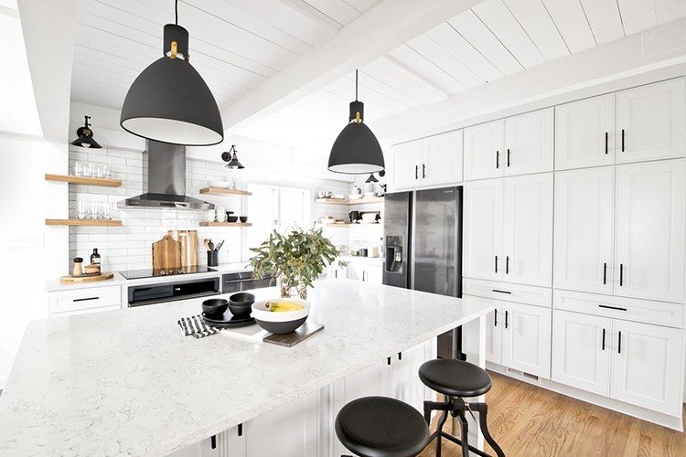
We also demoed the right corner wall to open the space up and accommodate a large center island. I love how open it feels now! The island is probably my favorite part of the space. We went from a tiny island that was essentially only large enough to accommodate the cooktop to a 6-ft. x 7-in. x 4-ft. x 4-in. countertop. Perfect for preparing food and for friends and family to gather before a meal.
We were able to get a custom cabinet look without the price by utilizing Kraftmaid cabinets in creative ways.
The floor to ceiling cabinets to the right of the refrigerator were created by stacking multiple cabinets to get just the right height. Adding a line of drawers breaks up the doors and adds storage for small flat items, like utensils. The simple flat moulding at the top provides room to get it perfect at the top.
Pro-tip: if you have uneven wood ceilings like we do, get a two-part moulding. It gives a little more flexibility to be adjusted as it’s installed.
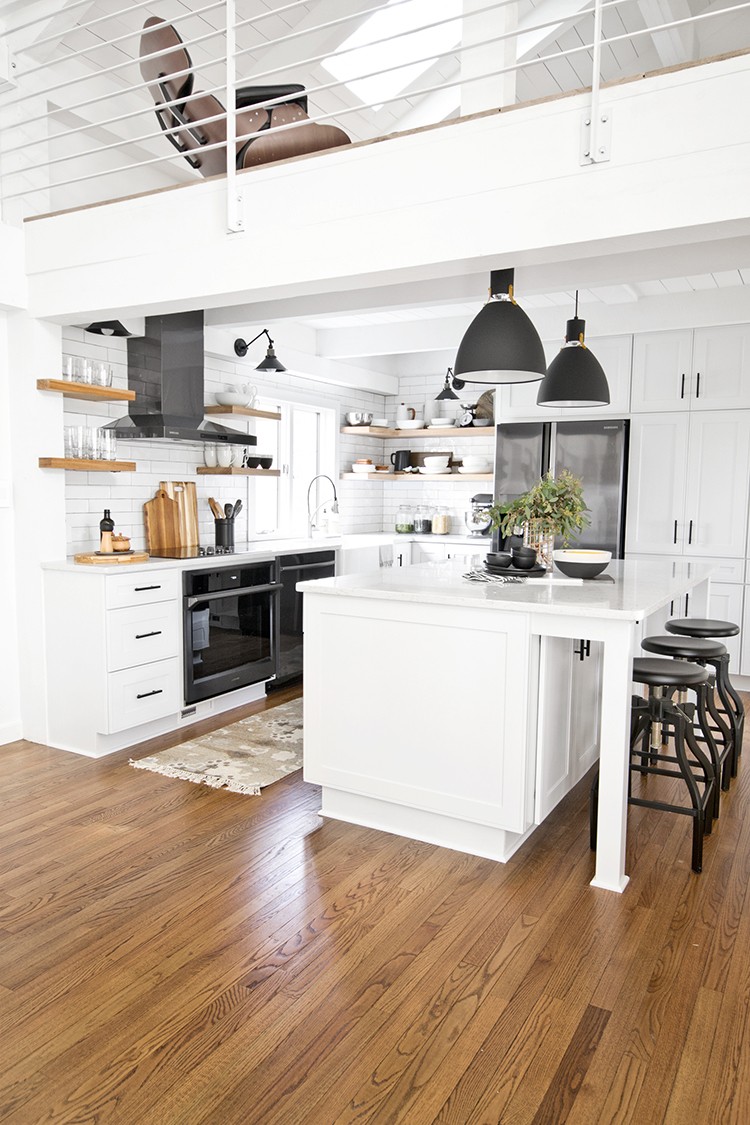
Another way we utilized Kraftmaid cabinets was through the island. It’s composed of a 24-in. deep cabinet and a 12-in. deep cabinet with an end panel that matches the doors on each side to cover the seams of where the cabinets meet. Adding a 14-in. overhang and 3-in. square legs provides lots of storage and a place to eat!
One of my biggest complaints about our previous kitchen was the lack of smart storage. Having a place for everything prevents things from being piled on top of each other in cabinets and keeps clutter off of the countertop.
Cabinets
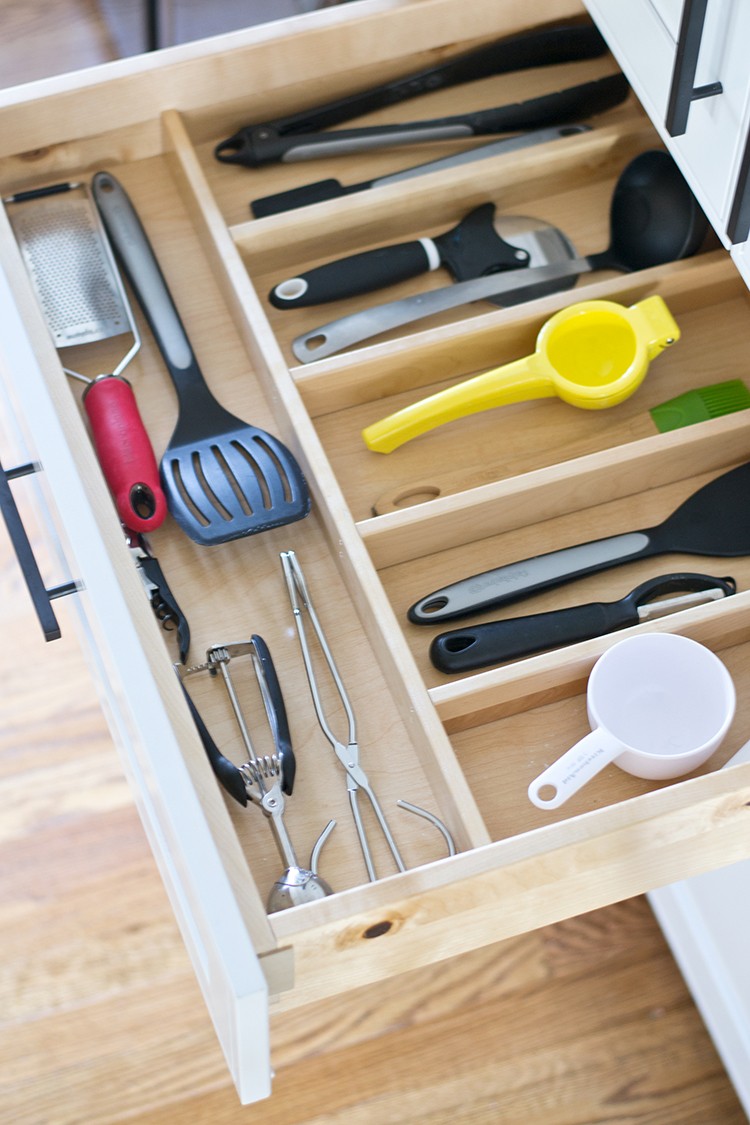
The large drawers to the right of the refrigerator have wooden dividers, which came installed from Kraftmaid. I used to have a deep drawer where utensils were tossed in. I donated extra utensils that were duplicates or not used. Now everything has a place and is easy to find!
The wood tiered drawer storage is perfect for small utensils. I love that it utilizes the entire height of the drawer by including two sections. The top slides back to reveal a second space below. Genius!

We also selected a spice drawer insert. I love that all the spices are within easy reach and easy to find. No more searching through cabinets trying to find the right spice!

Trash and recycling are also hidden within the cabinet, but within easy reach with a roll-out drawer.
Living in several rentals, we’ve used lots of different cabinets. These are by far the nicest cabinets that we’ve used. They are solid, with maple construction and dovetail joinery, have soft close drawers and doors, and a variety of accessories and options. We love them!
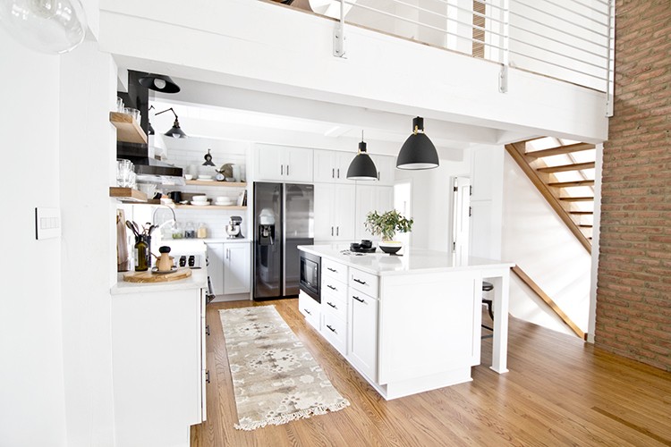
My number one must have in the space was large walkways. It makes working in the space much more functional. Multiple people (and two dogs!) can be in the space and not constantly bump into each other. If space allows, 42-in. wide is a good rule of thumb for walkways in kitchens.
Appliances
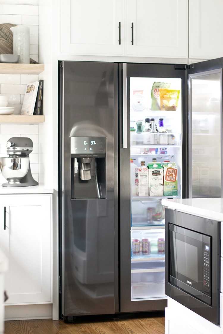
Throughout the space, we went with black stainless appliances from Samsung. I love the fresh take on stainless and how it contrasts with the bright white cabinets.
Countertops

For the countertops, we went with a marble look quartz, White Arabesque by Silestone. I love that we get the look of marble, but without the maintenance. It’s extremely durable, heat, stain, scratch, and impact resistant and never needs to be sealed!
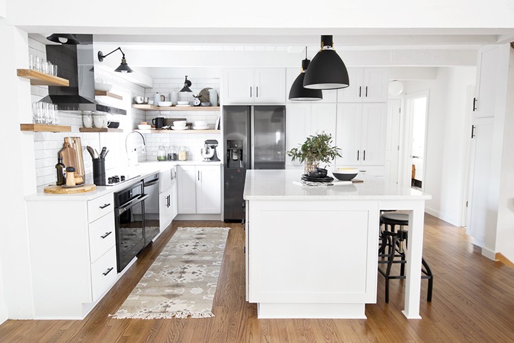
The open shelving was a DIY—we used white oak that was cut to fit our space and hidden steel brackets. We’re able to keep it neat and tidy by eliminating dishes that we weren’t using and keeping everyday dishes within arms reach in stacks. I love the open feel and warmth that it adds to the space!
Lighting and Accessories
With our wood ceiling, we can’t easily use recessed lighting, so having a variety of lights was important. The large pendants light up the island, the sconces above the open shelving light the outer countertops. Under-shelf lighting creates a soft light that also lights the countertops.
And did I mention that all lighting, furniture and most of the accessories are available at The Home Depot! I’m obsessed with our space and how it came together. I used to dread being in our kitchen because it was dark and cramped. Now it’s my favorite room in the house!
The post Stylish and Customizable Kitchen Makeover appeared first on The Home Depot Blog.
